KPI Trend Chart
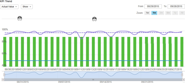
The KPI Trend Chart ![]() in KPI View displays KPI performance data for a single employee or organization and a single KPI as a colored line graph indicating the scoring trend Feature in Speech and Text Analytics that helps users identify changes in customer communication with the contact center, understand any emerging tendencies, and pinpoint any significant events that may require close attention. over the defined time period.
in KPI View displays KPI performance data for a single employee or organization and a single KPI as a colored line graph indicating the scoring trend Feature in Speech and Text Analytics that helps users identify changes in customer communication with the contact center, understand any emerging tendencies, and pinpoint any significant events that may require close attention. over the defined time period.
The chart includes interactive elements for date controls, graph lines, and views.
|
Element |
Description |
|---|---|
|
Date Controls |
|
|
Graph Lines and Bars |
Point to the graph lines and bars to view specific data for the KPI based on the defined time period. The displayed lines, bars, and data vary depending on your selections in the Show drop-down list. |
|
Coaching Application that provides a method of directing, instructing and training a person or group of people, with the aim of achieving a set goal or developing specific skills. and eLearning Product that provides hard and soft skills training, applicable for the entire employee life cycle (before, during, and after the hiring process), and includes training assessment and design tools. Events |
|
|
Actual Value |
|
|
Peer Value |
|
|
Show |
When exporting or printing KPI Trend Chart, the export or print includes the items and events selected to show. The export or print does not include event details. For a periodicity higher than daily, events may occur between the dates of the periodicity. In this case, the events display in between the periodicity points in the KPI Trend Chart. |
|
Coaching and eLearning Events |
If you have the privilege to View Events on Graph, Coaching and eLearning icons appear on the KPI Trend Chart. The eLearning icon appears on the date that the lesson was completed. For Coaching, the icon appears at the scheduled date, but only once the coaching event has been completed. Point to the Coaching event icon to see the following:
Point to the eLearning event icon to see the following:
Click a Coaching or eLearning event icon to drill down to the actual event. |
|
Bottom Zoom Chart |
Displays the KPI line (not an average of the goal line and KPI line). |